Wednesday, May 14, 2008
Artist Statement
I think I succeeded in many different areas during this class this past year. One of my biggest successes includes my growth in Photoshop. At the beginning of the year I had never used Photoshop at all. Throughout the year I gained experience through our various assignments. I feel like the biggest accomplishments I’ve made this year would be my growth in this area. I am not comfortable with Photoshop.
Along with success come many struggles. This year I struggled with one of my biggest successes, Photoshop. I was a beginner at Photoshop so learning took me a while to get the hang of. I started off slow but now I am pretty good at it. I struggled at first because I had never used it before but now I am an efficient Photoshop user.
I am a firm believer that there is always an area where you can improve in some area of your life. I feel like there is many more things I have not yet learned about in Photoshop and am motivated to keep learning. I intend to keep using and learning about Photoshop in the future.
I had many influences this year and hope that they reflected in my work. The biggest influence in my work would have to be my family. They are constantly there and it would be impossible for me to not have them as my biggest influence. I was influenced my friends and also myself. These were my influences this year. I really enjoyed my Photo class this year, it was great.
Monday, May 12, 2008
Thursday, May 8, 2008
Self Portraits
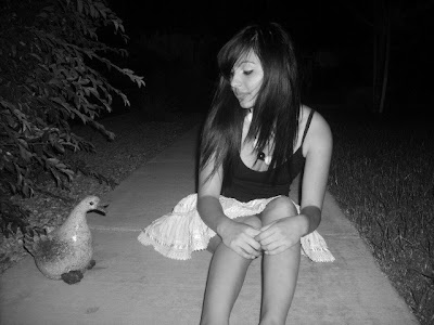
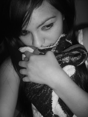
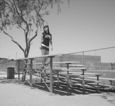
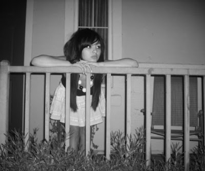
Entering this project, I was scared and flustered because we were limited on time and I was concerned that I wouldn’t have the time I would need to take the pictures I had in mind. Immediately, I had a million ideas of what to do for my self portraits. I wanted to express myself in a way that was tranquil and peaceful. I stuck with the same idea throughout the work of my self portraits. They changed slightly because again I was limited on time. The photo that I think is the most creative would have to be the Rule of thirds picture. I feel like this one was the most creative because the feel of the picture is calm and cute and I like that. It was difficult trying to express myself the way I intended to without smiling. I think if one opens their mind to new things the success of the creativity of the photo will be great.
In all my photos I incorporated composition. I wore black and white clothing in all my pictures. Luckily my personal prop was my blanket that I’ve had since I was born is black and white. In each photo I thought about what black, whites and grey’s I was going to get from myself and also the setting. The “happy accidents” I came across were just the fact that my blacks were darker then I expected and the white’s were lighter then I expected also. Composition is a hard element of a picture to get perfect. One has to have everything in the correct spot to have a really well balanced photo. The picture that has the best composition in my opinion would be the Rule of Thirds. This has the best composition because the blacks are dark and the whites are white. I would change the composition in my light picture because the photo was so light the picture came out grey.
I feel like the light picture could have been darker in some areas. The sun was so bright that day the picture came out grey. I was pleased to find out that none of my pictures came out blurry. I adjusted the ISO and shutter speed in a few of the pictures I took. I think the craftsmanship turned out pretty good for my photos. There is always room for improvement for me.
Overall, I think I did well on my self portraits. I think they have a peaceful, relaxing feel to them and that is what I was ultimately going for. I think I did well at sticking with my theme and incorporating the setting and clothing with the pictures. If I had the same assignment again I would get some really interesting backgrounds to my photos. My favorite pictures would have to be the Rule of Thirds photo and also the Element photo. I like the way those turned out. The one I least liked was the personal prop because it was so close up and I don’t like close ups. I enjoyed this project and am ready to take some more pictures.
Thursday, May 1, 2008
Shutter Speed
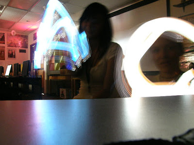
Shutter speed is a very important tool and should be used frequently. In this picture my shutter speed was very slow and that is why the quality of the picture came out looking this way. The photo was supposed to come out with a blur around Kalyim and he was supposed to be clearly walking. If the shutter speed was shorter than it would have captured what was intended for this photo. Tip for the future, use shutter speed for photos.
Tuesday, April 29, 2008
ISO-flim speed
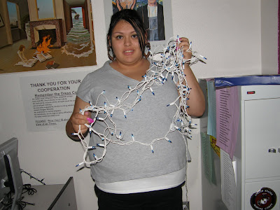
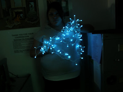
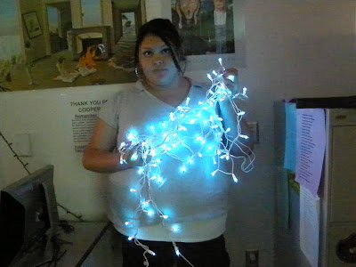
As a class we experimented with ISO. We started off by taking a picture of our partner in a dark room, lit up with Christmas lights, with the flash on. We then turned the flash off, and with our camera on P mode (Program mode:The camera chooses the appropriate aperture and shutter speed) we took pictures at different intervals up the ISO scale.
Friday, April 18, 2008
Lighting Metering
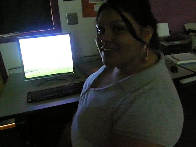
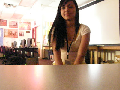
For this assignment the first picture we took we had to meter the computer screen, then take a picture of your partner. For the next picture we metered the color or our partners skin, then took the picture. The contrasting turnouts were because the camera was measuring different lightings. The metering was a lot better in the second picture because Candace's skin color measured the lighting for the whole picture.
Wednesday, April 9, 2008
Personal Metaphor
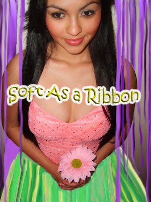
The composition of my work was very easy to comprehend. I had a picture of the upper half of my body and the lower half ribbon and also a few strand of ribbon around me. The picture was also close up so it wasn’t hard to figure out that I was the emphasis. My picture was balanced also because it was close up and I was in the center. The piece was balanced because there wasn’t a whole lot to it; it was just me and ribbon. The picture was unified again because it was myself and ribbon alone.
This definitely wasn’t my best work that I have done in this class. I feel like I could have done a better job on blending myself to the ribbon. Some of the strands of ribbon looked unreal and some looked real. Overall I think I did well on the project. My idea reflects my feeling towards myself and was original. I actually turned myself into an object or ribbon. The difficult part was making the ribbon look real even though I had actually gone out and took pictures of the ribbon myself. If I could change anything about my project I would take more time to make each individual ribbon look more real.
Tuesday, March 18, 2008
The Aesthetic Expierience
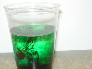 In class we did a project that was called the Aesthetic Expierence. It definitely was an expierience that made me think about things. During my Expierience, i felt an overwhelming sense of the corrupt things about this world that most people are used to or can't see anymore. Things that destroy or hurt people are a way of life now days. The world is a beautiful place full of life and glorious things. My expierience made me aware and realize the dirty and bad things in this world, that simply should be. I felt a care for the world we live in and wish that i could some how protect it so everyone could live happily ever after.
Thursday, March 6, 2008
Hybrid
Monday, February 25, 2008
Movie Moments
Inspired by Cindy Sherman, a contemporary photographer who took photo's of herself starring in movies that never existed.
Movie Title: Love Between a Boy and Girl
Genre: Romance
The movie is based in the 1950’s and 60’s. It starts off when a boy (
Christopher) meets a girl (Jessica) and they fall head over heals for each other. The characters do everything together and everything seems to be going perfect. One day Jessica finds Christopher and his ex girlfriend (Christine) at a romantic lunch together. Jessica grows furious with Christopher and refuses to talk to him. Both Christopher and Christine try to explain the incident to Jessica but she is to prideful to let either one of them close. Jessica lets two weeks go by before she gives Christopher a chance to explain himself. It turns out the romantic lunch Jessica walked in on was really a chance for Christopher to ask for advice about his proposal to Jessica. Over the years Christine and Christopher grew to be close friends and she was the only woman left in his life besides Jessica. In the end Jessica and Christopher got married and live happily ever after.
In this scene, Christopher and Jessica are at their first stage's of Love. They are having tea together. At the spur of the moment, they kiss.
Thursday, February 14, 2008
Chocolate Frog
Friday, February 8, 2008
Monday, February 4, 2008
Aged Photo
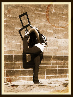 For this photo, we used one of our balance and frame photos to make a "Aged Photo". We practiced our Photoshop skills and learned new ones to create the overall piece. I love the Aged Photo look.
Tuesday, January 29, 2008
Random Object
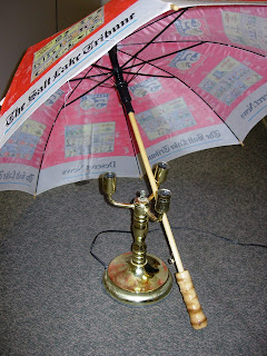 We were each assigned a random object to photograph. We could choose to have it in color or black & white. We were to focus on "The Three C's".
This is a picture of my random object. My object was the lamp without bulbs. It was hard for me to figure out exactly what I wanted to do with it. I finally decided to put the umbrella over it to create something new. The picture could have had better lighting and a different background.
Wednesday, January 23, 2008
Egg Challenge
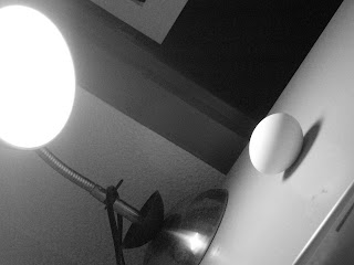
I believe my black and white photo was the most successful because it all three of he elements the best. I love the way the black and white shows contrast between the background,light and egg. I also enjoy the angle.


